Seite 1 von 1
Tikz Diagramme richtig darstellen
Verfasst: Sa 28. Mai 2016, 16:54
von feuerfalke2005
Hallo Lieb Latex Freunde
ich bin hier neu und in Latx und in TikZ kompletter Anfänger.
Ich habe nun schon über all gesucht und leider nicth direkt fündig geworden was ich brauch besonders in bezug auf eine anleitung zu TikZ/PGF.
Ich bin gerade an einer Studienarbeit und unter Zeit Druck ich bäruchte also Dringend Eure hilfe.
Ich will Verschiedene Graphen darsellen mit Skalierten Achsen.
Habe auch schon ein Paar kleine Erfolge. Es entspricht aber noch nicht wie ich es gerne haben würde.
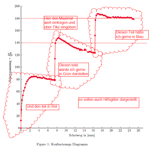
Hier ist meine Datei für einen Graphen den ich gerne in 3 Farben darstellen würde und auch die MAximal werte mit Knoten bezeichnung zu versehen (Kasten mit Fänchen).
\documentclass[11pt]{article}
\usepackage[T1]{fontenc}
\usepackage{pgfplots}

\pgfplotsset{compat=1.12}  % Wenn nötig, Versionsnummer runter oder auf »newest« setzen

\begin{document}
\begin{figure}
	\begin{tikzpicture}
	\begin{axis}[
	width=14cm,
	height=14cm,
	scale only axis,
	xmin=0,
	xmax=27,
	xlabel={Scherweg in [mm]},
	ymin=0,
	ymax=200,
	ylabel={Scherspannung $\tau$ $\frac{kN}{m^2}$},
	axis x line*=bottom, %top,
	axis y line*=left
	%	nodes near coords,
	%	point meta={explicit symbolic}
	]
	\addplot [
	color= blue,red,
	line width=1.5pt,
	mark size=2.0pt,
	%only marks,
	mark=ball,
	mark options={solid},
	forget plot
	]
	table[row sep=crcr]{
		0.000	0.000\\
		0.020	12.669\\
		0.120	30.405\\
		0.270	46.001\\
		0.455	53.668\\
		0.655	61.335\\
		0.900	66.446\\
		1.120	72.835\\
		1.350	76.668\\
		1.590	79.224\\
		1.845	81.780\\
		2.100	83.057\\
		2.355	84.335\\
		2.610	84.335\\
		2.880	84.846\\
		3.100	84.719\\
		3.420	84.667\\
		3.680	83.057\\
		3.950	83.057\\
		4.220	83.057\\
		4.500	82.291\\
		4.760	82.035\\
		5.035	83.569\\
		5.300	81.780\\
		5.570	81.268\\
		5.790	80.502\\
		6.120	80.502\\
		6.380	80.502\\
		6.670	80.502\\
		6.950	79.224\\
		7.200	79.224\\
		7.500	79.224\\
		7.550	79.224\\
		7.540	78.545\\
		7.500	78.545\\
		7.550	114.017\\
		7.615	139.354\\
		7.835	144.422\\
		8.090	146.956\\
		8.350	148.222\\
		8.620	146.956\\
		8.890	145.689\\
		9.165	144.422\\
		9.435	143.155\\
		9.715	142.395\\
		9.995	140.621\\
		10.260	139.354\\
		10.530	138.341\\
		10.805	136.821\\
		11.090	135.554\\
		11.360	134.287\\
		11.640	133.020\\
		11.900	132.260\\
		12.175	131.753\\
		12.440	130.486\\
		12.720	130.486\\
		12.990	129.220\\
		13.010	129.220\\
		13.260	129.220\\
		13.520	127.953\\
		13.080	127.953\\
		14.085	127.953\\
		14.325	128.459\\
		14.162	129.220\\
		14.870	124.659\\
		15.135	125.419\\
		15.400	125.419\\
		15.680	124.152\\
		15.950	124.152\\
		16.220	123.645\\
		16.320	123.645\\
		16.400	123.392\\
		16.420	152.023\\
		16.485	177.360\\
		16.690	184.961\\
		16.940	187.495\\
		17.205	187.495\\
		17.470	186.228\\
		17.745	186.228\\
		18.020	186.228\\
		18.280	184.961\\
		18.540	184.961\\
		18.815	183.694\\
		19.090	182.428\\
		19.350	181.921\\
		19.625	181.414\\
		19.895	181.161\\
		19.160	181.161\\
		20.410	182.428\\
		20.690	181.414\\
		20.960	182.174\\
		21.225	181.161\\
		21.475	182.428\\
		21.750	181.161\\
		22.020	181.921\\
		22.285	181.161\\
		22.550	181.161\\
		22.810	181.161\\
		23.085	181.161\\
		23.350	181.161\\
		23.620	181.921\\
		23.950	181.161\\
		24.150	181.161\\
		24.420	181.161\\
		24.690	179.387\\
		24.960	178.627\\
	};
	\end{axis}
	\end{tikzpicture}
	\caption{Kraftsetzungs Diagramm}
\end{figure}
\end{document}
Ich habe schon vieles Probiert und auch in der Anleitung von PGF habe ich leider nicht so das richtige gefunden. Ich bitte daher um eure Hilfe die ich hier wirklich dringend bräuchte.
Ich danke noch mals für die Hilfe und eure Freundlichekeit in bezug auf meine Anungslosikeit.
Danke
Gruss
Verfasst: Sa 28. Mai 2016, 18:22
von Stefan Kottwitz
Willkommen im Forum!
Jeder hat mal angefangen. Und Du hast schon genau das richtige Werkzeug gefunden! Schöner Start, den Du gepostet hast. Da findet sich sicher schnell Hilfe. Für den schnellen Überblick über das Thema hänge ich Dein PDF mal direkt als Bild hier rein:
Stefan
Verfasst: Sa 28. Mai 2016, 20:16
von Beinschuss
Sehr schönes erstes Minimalbeispiel. Ergänze
bei den Achsenoptionen und schon hast Du ein Hilfsgitter.
Verfasst: Sa 28. Mai 2016, 22:12
von esdd
Hier ist mal ein Ansatz:
\begin{filecontents*}{daten.dat}
0.000   0.000
0.020   12.669
0.120   30.405
0.270   46.001
0.455   53.668
0.655   61.335
0.900   66.446
1.120   72.835
1.350   76.668
1.590   79.224
1.845   81.780
2.100   83.057
2.355   84.335
2.610   84.335
2.880   84.846
3.100   84.719
3.420   84.667
3.680   83.057
3.950   83.057
4.220   83.057
4.500   82.291
4.760   82.035
5.035   83.569
5.300   81.780
5.570   81.268
5.790   80.502
6.120   80.502
6.380   80.502
6.670   80.502
6.950   79.224
7.200   79.224
7.500   79.224
7.550   79.224
7.540   78.545
7.500   78.545
7.550   114.017
7.615   139.354
7.835   144.422
8.090   146.956
8.350   148.222
8.620   146.956
8.890   145.689
9.165   144.422
9.435   143.155
9.715   142.395
9.995   140.621
10.260   139.354
10.530   138.341
10.805   136.821
11.090   135.554
11.360   134.287
11.640   133.020
11.900   132.260
12.175   131.753
12.440   130.486
12.720   130.486
12.990   129.220
13.010   129.220
13.260   129.220
13.520   127.953
13.080   127.953
14.085   127.953
14.325   128.459
14.162   129.220
14.870   124.659
15.135   125.419
15.400   125.419
15.680   124.152
15.950   124.152
16.220   123.645
16.320   123.645
16.400   123.392
16.420   152.023
16.485   177.360
16.690   184.961
16.940   187.495
17.205   187.495
17.470   186.228
17.745   186.228
18.020   186.228
18.280   184.961
18.540   184.961
18.815   183.694
19.090   182.428
19.350   181.921
19.625   181.414
19.895   181.161
19.160   181.161
20.410   182.428
20.690   181.414
20.960   182.174
21.225   181.161
21.475   182.428
21.750   181.161
22.020   181.921
22.285   181.161
22.550   181.161
22.810   181.161
23.085   181.161
23.350   181.161
23.620   181.921
23.950   181.161
24.150   181.161
24.420   181.161
24.690   179.387
24.960   178.627
\end{filecontents*}


\documentclass[11pt]{article}
\usepackage[T1]{fontenc}
\usepackage{pgfplots}
\pgfplotsset{compat=1.12}  % Wenn nötig, Versionsnummer runter oder auf »newest« setzen

\begin{document}
\begin{figure}
  \begin{tikzpicture}
    \begin{axis}[
        width=14cm,
        height=14cm,
        scale only axis,
        xmin=0,
        xmax=27,
        xlabel={Scherweg in [mm]},
        ymin=0,
        ymax=200,
        ylabel={Scherspannung $\tau$ $\frac{kN}{m^2}$},
        axis x line*=bottom, %top,
        axis y line*=left,
        grid=major,
        every axis plot/.append style={
          line width=1.5pt,
          mark size=2pt,
          mark=ball,forget plot,
          visualization depends on={x \as \myvalue},
        },
        point meta=y,
        nodes near coords={
          \ifdim \myvalue pt=8.35pt \pgfmathprintnumber{\pgfplotspointmeta}\fi
        },
        nodes near coords style={text=black}
      ]
      \addplot [red] table[restrict expr to domain={\thisrowno{0}}{0:7.5}] {daten.dat};
      \addplot [green] table[restrict expr to domain={\thisrowno{0}}{7.5:16.4}] {daten.dat};
      \addplot [blue] table[restrict expr to domain={\thisrowno{0}}{16.4:25}] {daten.dat};
    \end{axis}
  \end{tikzpicture}
  \caption{Kraftsetzungs Diagramm}
\end{figure}
\end{document} 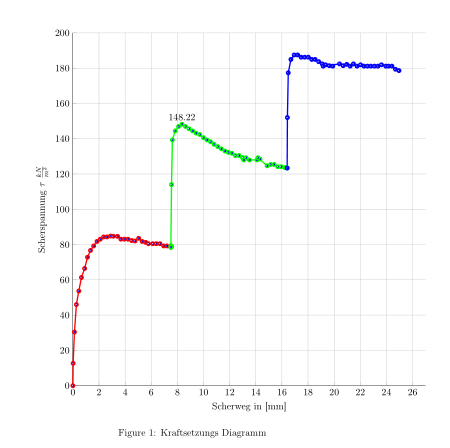
Verfasst: Sa 28. Mai 2016, 23:37
von feuerfalke2005
Danke für die Schnelle Hilfe
Ich würde gerne noch eine Bitte stellen wäre es möglich die einzelne Befehle zu komentieren damit ich es das nächste mal kommplett selber machen kann.
Ich würde gerne sobestimmte Dinge nachvoll ziehen kann, so kann ich diese für andere Graphen wieder verwenden.
Ich habe das Beispiel in meinem Editor kopiert leider Läut Texstudio ein knappe evigkeit zum Übersetzen.
Und noch eine kleinigkeit wie kann ich für Roten Graphen und den Blauen Graphen die maximal werte ein zutragen.
Ist es eigentliche möglich vom Maximalpunkt zur X Achse einen Linie zu ziehen.
Und noch mals vielen danke für die Schnelle hilfe.
Die tollen möglichkeiten die es mit TikZ gibt werden durch eure Hilfe jetzt gerade lerne.
Danke Danke Danke
Verfasst: So 29. Mai 2016, 00:45
von esdd
Ich habe das jetzt mal noch etwas vereinfacht. Da der x-Wert des jeweiligen Maximums von Hand gesucht werden musste/muss, kann man da auch gleich de y-Wert mit ablesen.
\begin{filecontents*}{daten.dat}
     0.000   0.000
     0.020   12.669
     0.120   30.405
     0.270   46.001
     0.455   53.668
     0.655   61.335
     0.900   66.446
     1.120   72.835
     1.350   76.668
     1.590   79.224
     1.845   81.780
     2.100   83.057
     2.355   84.335
     2.610   84.335
     2.880   84.846
     3.100   84.719
     3.420   84.667
     3.680   83.057
     3.950   83.057
     4.220   83.057
     4.500   82.291
     4.760   82.035
     5.035   83.569
     5.300   81.780
     5.570   81.268
     5.790   80.502
     6.120   80.502
     6.380   80.502
     6.670   80.502
     6.950   79.224
     7.200   79.224
     7.500   79.224
     7.550   79.224
     7.540   78.545
     7.500   78.545
     7.550   114.017
     7.615   139.354
     7.835   144.422
     8.090   146.956
     8.350   148.222
     8.620   146.956
     8.890   145.689
     9.165   144.422
     9.435   143.155
     9.715   142.395
     9.995   140.621
     10.260   139.354
     10.530   138.341
     10.805   136.821
     11.090   135.554
     11.360   134.287
     11.640   133.020
     11.900   132.260
     12.175   131.753
     12.440   130.486
     12.720   130.486
     12.990   129.220
     13.010   129.220
     13.260   129.220
     13.520   127.953
     13.080   127.953
     14.085   127.953
     14.325   128.459
     14.162   129.220
     14.870   124.659
     15.135   125.419
     15.400   125.419
     15.680   124.152
     15.950   124.152
     16.220   123.645
     16.320   123.645
     16.400   123.392
     16.420   152.023
     16.485   177.360
     16.690   184.961
     16.940   187.495
     17.205   187.495
     17.470   186.228
     17.745   186.228
     18.020   186.228
     18.280   184.961
     18.540   184.961
     18.815   183.694
     19.090   182.428
     19.350   181.921
     19.625   181.414
     19.895   181.161
     19.160   181.161
     20.410   182.428
     20.690   181.414
     20.960   182.174
     21.225   181.161
     21.475   182.428
     21.750   181.161
     22.020   181.921
     22.285   181.161
     22.550   181.161
     22.810   181.161
     23.085   181.161
     23.350   181.161
     23.620   181.921
     23.950   181.161
     24.150   181.161
     24.420   181.161
     24.690   179.387
     24.960   178.627
\end{filecontents*}

\documentclass[11pt]{article}
\usepackage[T1]{fontenc}
\usepackage{pgfplots}
\pgfplotsset{compat=1.12}  % Wenn nötig, Versionsnummer runter oder auf »newest« setzen

\begin{document}
\begin{figure}
   \begin{tikzpicture}
     \begin{axis}[
         width=14cm,
         height=14cm,
         scale only axis,
         xmin=0,
         xmax=27,
         xlabel={Scherweg in [mm]},
         ymin=0,
         ymax=200,
         ylabel={Scherspannung $\tau$ $\frac{kN}{m^2}$},
         axis x line*=bottom, %top,
         axis y line*=left,
         grid=major,
         every axis plot/.append style={
           line width=1.5pt,
           mark size=2pt,
           mark=ball,
           forget plot
         },
       ]
       \addplot [red] table[restrict expr to domain={\thisrowno{0}}{0:7.5}] {daten.dat};
       \addplot [green] table[restrict expr to domain={\thisrowno{0}}{7.5:16.4}] {daten.dat};
       \addplot [blue] table[restrict expr to domain={\thisrowno{0}}{16.4:25}] {daten.dat};
%
       \draw(2.88,84.846)coordinate[label=above:\pgfmathprintnumber{84.846}](h)--(h|-0,0);
       \draw(8.35,148.222)coordinate[label=above:\pgfmathprintnumber{148.222}](h)--(h|-0,0);
       \draw(16.940,187.495)coordinate[label=above:\pgfmathprintnumber{187.495}](h)--(h|-0,0);
     \end{axis}
   \end{tikzpicture}
   \caption{Kraftsetzungs Diagramm}
\end{figure}
\end{document}
Die Befehle und Optionen kann man eigentlich alle in der Paketdoku von
pgfplots nachschlagen.
Verfasst: So 29. Mai 2016, 07:25
von Bartman
Ich habe mir erlaubt, in dem Beispiel von esdd ein paar "Nebensächlichkeiten" zu ändern.
\begin{filecontents*}{daten.dat}
     0.000   0.000
     0.020   12.669
     0.120   30.405
     0.270   46.001
     0.455   53.668
     0.655   61.335
     0.900   66.446
     1.120   72.835
     1.350   76.668
     1.590   79.224
     1.845   81.780
     2.100   83.057
     2.355   84.335
     2.610   84.335
     2.880   84.846
     3.100   84.719
     3.420   84.667
     3.680   83.057
     3.950   83.057
     4.220   83.057
     4.500   82.291
     4.760   82.035
     5.035   83.569
     5.300   81.780
     5.570   81.268
     5.790   80.502
     6.120   80.502
     6.380   80.502
     6.670   80.502
     6.950   79.224
     7.200   79.224
     7.500   79.224
     7.550   79.224
     7.540   78.545
     7.500   78.545
     7.550   114.017
     7.615   139.354
     7.835   144.422
     8.090   146.956
     8.350   148.222
     8.620   146.956
     8.890   145.689
     9.165   144.422
     9.435   143.155
     9.715   142.395
     9.995   140.621
     10.260   139.354
     10.530   138.341
     10.805   136.821
     11.090   135.554
     11.360   134.287
     11.640   133.020
     11.900   132.260
     12.175   131.753
     12.440   130.486
     12.720   130.486
     12.990   129.220
     13.010   129.220
     13.260   129.220
     13.520   127.953
     13.080   127.953
     14.085   127.953
     14.325   128.459
     14.162   129.220
     14.870   124.659
     15.135   125.419
     15.400   125.419
     15.680   124.152
     15.950   124.152
     16.220   123.645
     16.320   123.645
     16.400   123.392
     16.420   152.023
     16.485   177.360
     16.690   184.961
     16.940   187.495
     17.205   187.495
     17.470   186.228
     17.745   186.228
     18.020   186.228
     18.280   184.961
     18.540   184.961
     18.815   183.694
     19.090   182.428
     19.350   181.921
     19.625   181.414
     19.895   181.161
     19.160   181.161
     20.410   182.428
     20.690   181.414
     20.960   182.174
     21.225   181.161
     21.475   182.428
     21.750   181.161
     22.020   181.921
     22.285   181.161
     22.550   181.161
     22.810   181.161
     23.085   181.161
     23.350   181.161
     23.620   181.921
     23.950   181.161
     24.150   181.161
     24.420   181.161
     24.690   179.387
     24.960   178.627
\end{filecontents*}

\documentclass[11pt]{article}
\usepackage[T1]{fontenc}
\usepackage[ngerman]{babel}
\usepackage{showframe} % Für die Seitenränder
\usepackage{siunitx} % <- hinzugefügt
\usepackage{pgfplots}

\pgfplotsset{
	compat=1.12, % Wenn nötig, Versionsnummer runter oder auf »newest« setzen
	/pgf/number format/.cd, use comma % Setzt ein Komma statt einem Punkt als Dezimaltrennzeichen
}

\sisetup{
%	locale=DE, % Lokalisation der Dezimaltrennzeichen wird in diesem Beispiel nicht benötigt
    per-mode=fraction % Bestimmt die Bruchdarstellung der Maßeinheiten im gesamten Dokument
}

\begin{document}
\begin{figure}
	\centering
   \begin{tikzpicture}
     \begin{axis}[
         width=10.8cm, % <- geändert
%         height=14cm,
         scale only axis,
         xmin=0,
         xmax=27,
         xlabel={Scherweg in [\si{\mm}]}, % <- geändert
         ymin=0,
         ymax=200,
         ylabel={Scherspannung $\tau$ in \Big[\si{\kN\per\m\squared}\Big]}, % <- geändert
         axis x line*=bottom, %top,
         axis y line*=left,
         grid=major,
         every axis plot/.append style={
           line width=1.5pt,
           mark size=2pt,
           mark=ball,
           forget plot
         },
       ]
       \addplot [red] table[restrict expr to domain={\thisrowno{0}}{0:7.5}] {daten.dat};
       \addplot [green] table[restrict expr to domain={\thisrowno{0}}{7.5:16.4}] {daten.dat};
       \addplot [blue] table[restrict expr to domain={\thisrowno{0}}{16.4:25}] {daten.dat};
%
       \draw(2.88,84.846)coordinate[label=above:\pgfmathprintnumber{84.846}](h)--(h|-0,0);
       \draw(8.35,148.222)coordinate[label=above:\pgfmathprintnumber{148.222}](h)--(h|-0,0);
       \draw(16.940,187.495)coordinate[label=above:\pgfmathprintnumber{187.495}](h)--(h|-0,0);
     \end{axis}
   \end{tikzpicture}
   \caption{Kraftsetzungs Diagramm}
\end{figure}
\end{document}
Verfasst: So 29. Mai 2016, 11:29
von feuerfalke2005
Danke für die Antwort:
So manche dinge Funktionieren nicht so richtig bei mir.
Hier ist mal meine umsetzung.
\begin{filecontents*}{daten.dat}
     0.000   0.000
     0.020   12.669
     0.120   30.405
     0.270   46.001
     0.455   53.668
     0.655   61.335
     0.900   66.446
     1.120   72.835
     1.350   76.668
     1.590   79.224
     1.845   81.780
     2.100   83.057
     2.355   84.335
     2.610   84.335
     2.880   84.846
     3.100   84.719
     3.420   84.667
     3.680   83.057
     3.950   83.057
     4.220   83.057
     4.500   82.291
     4.760   82.035
     5.035   83.569
     5.300   81.780
     5.570   81.268
     5.790   80.502
     6.120   80.502
     6.380   80.502
     6.670   80.502
     6.950   79.224
     7.200   79.224
     7.500   79.224
     7.550   79.224
     7.540   78.545
     7.500   78.545
     7.550   114.017
     7.615   139.354
     7.835   144.422
     8.090   146.956
     8.350   148.222
     8.620   146.956
     8.890   145.689
     9.165   144.422
     9.435   143.155
     9.715   142.395
     9.995   140.621
     10.260   139.354
     10.530   138.341
     10.805   136.821
     11.090   135.554
     11.360   134.287
     11.640   133.020
     11.900   132.260
     12.175   131.753
     12.440   130.486
     12.720   130.486
     12.990   129.220
     13.010   129.220
     13.260   129.220
     13.520   127.953
     13.080   127.953
     14.085   127.953
     14.325   128.459
     14.162   129.220
     14.870   124.659
     15.135   125.419
     15.400   125.419
     15.680   124.152
     15.950   124.152
     16.220   123.645
     16.320   123.645
     16.400   123.392
     16.420   152.023
     16.485   177.360
     16.690   184.961
     16.940   187.495
     17.205   187.495
     17.470   186.228
     17.745   186.228
     18.020   186.228
     18.280   184.961
     18.540   184.961
     18.815   183.694
     19.090   182.428
     19.350   181.921
     19.625   181.414
     19.895   181.161
     19.160   181.161
     20.410   182.428
     20.690   181.414
     20.960   182.174
     21.225   181.161
     21.475   182.428
     21.750   181.161
     22.020   181.921
     22.285   181.161
     22.550   181.161
     22.810   181.161
     23.085   181.161
     23.350   181.161
     23.620   181.921
     23.950   181.161
     24.150   181.161
     24.420   181.161
     24.690   179.387
     24.960   178.627
\end{filecontents*}

\documentclass[11pt]{article}
\usepackage[T1]{fontenc}
\usepackage{pgfplots}
\pgfplotsset{compat=1.12}  % Wenn nötig, Versionsnummer runter oder auf »newest« setzen


\begin{figure}
  \begin{tikzpicture}
  \begin{axis}[
  width=14cm,
  height=10cm,
  scale only axis,
  xmin=0,
  xmax=27,
  xlabel={Scherweg in [\si {\mm}]},
  ymin=0,
  ymax=200,
  ylabel={Scherspannung $\tau$ in \Big[\si{\kN\per\m\squared}\Big]},
  axis x line*=bottom, %top,
  axis y line*=left,
  grid=major,
  every axis plot/.append style={
  	line width=1.5pt,
  	mark size=1.5pt,
  	mark=ball,forget plot,
  	visualization depends on={x \as \myvalue},
  },
  point meta=y,
% (Frage kann man hier eine Einstellung vornehmen um mit pins und textboxen zu arbeiten)
  nodes near coords={
  	\ifdim \myvalue pt=2.88pt \pgfmathprintnumber{\pgfplotspointmeta}\fi
  	\ifdim \myvalue pt=8.35pt \pgfmathprintnumber{\pgfplotspointmeta}\fi
  	\ifdim \myvalue pt=16.94pt \pgfmathprintnumber{\pgfplotspointmeta}\fi
  },
  nodes near coords style={text=black}
  ]
  \addplot [red] table[restrict expr to domain={\thisrowno{0}}{0:7.5}] {Versuch_E/datenS.dat};
  \addplot [green] table[restrict expr to domain={\thisrowno{0}}{7.5:16.4}] {Versuch_E/datenS.dat};
  \addplot [blue] table[restrict expr to domain={\thisrowno{0}}{16.4:25}] {Versuch_E/datenS.dat};
  \end{axis}
  \end{tikzpicture}
	\caption{Scherweg s - Scherspannung $\tau$ - Diagramm}
\end{figure}
Ich habe die Zeilen mit dem Draw wege gelassen da die Linien sich im Koordinate system nicht an der richtigen stelle einzeichnen lassen.
Danke für eure hilfe
Es wäre noch ein Diagramm von mir zu erstellen das in etwas so aussehen soll.
Wie kann ich hier das Bild direkt einfügen.
Danke noch mal für die Hilfe
Verfasst: So 29. Mai 2016, 21:08
von Bartman
feuerfalke2005 hat geschrieben:Es wäre noch ein Diagramm von mir zu erstellen das in etwas so aussehen soll.
Eröffne dafür besser einen neuen Thread.
feuerfalke2005 hat geschrieben:Wie kann ich hier das Bild direkt einfügen.
Lade ein Bildschirmfoto Deiner PDF-Datei in den Anhang. Per Rechtsklick auf "Download" kommst Du durch die Auswahl von z. B. "Link-Adresse kopieren" (Firefox) an die Adresse der Abbildung bei goLaTeX.de. Füge diese unter Verwendung des Img-Button in Deinen Beitrag ein. Mit einem Klick auf "Zitat" bei Stefans Beitrag siehst Du, wie es im Editor des Forums aussieht.