Seite 1 von 1

Säulendiagramm mit zwei y-Achsen

Verfasst: Mo 25. Jan 2016, 14:22
von Bieberbach
Hallo, ich bräuchte nocheinmal eure Hilfe.

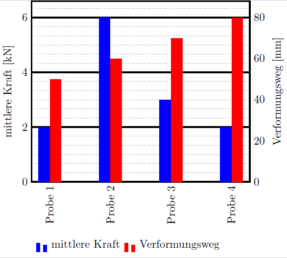
Ich möchte gerne ein Säulendiagramm erstellen, dass für bestimmte Zugproben an der linken y-Achse die Kraft und an der rechten y-Achse den Weg anzeigt.
(ich hab ein Bild beigefügt, welches mein Ziel verdeutlicht).

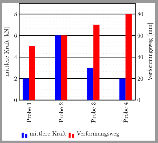
Ich habe mir dazu ein Besipiel von sourceforge heruntergeladen und es so weit ich konnte modifiziert. Ich weiß aber nicht so recht, ob ich da überhaupt auf dem richtigen Weg bin.

Die Idee war zwei "axis" Umgebungen zu verwenden, eine links und die andere rechts auszurichten und schließlich aus der zweiten alle unnötigen Dinge, wie die erneute Beschriftung der x-Achse, zu entfernen. Das hat aber nicht so gut geklappt.

Mein Problem ist nun die Anzeige der Legende die exakte Positionierung der Säulen nebeneinander und die Skalierung der Achsen. Beginnen sollten die Werte der y-Achsen bei 0.

Hier ist mein Minimalbeispiel:
\documentclass{article}

\usepackage{pgfplots}
\pgfplotsset{compat=newest}
\usepgfplotslibrary{units} 

\pgfplotsset{ 
     compat=newest, 
     minor grid style={dotted, gray, very thin}, 
     subtickwidth=0pt,
     tickwidth=0pt, 
     major grid style={black, very thick}, 
     major tick style={black, very thick},
     /pgfplots/ybar legend/.style={
        /pgfplots/legend image code/.code={
           \draw[##1,/tikz/.cd,yshift=-0.25em]
           (0cm,0cm) rectangle (3pt,0.8em);
        }, 
   },
}

\begin{document}

\begin{tikzpicture}
\begin{axis}[
   yticklabel pos=left,
   symbolic x coords = {Probe 1, Probe 2, Probe 3, Probe 4},
   x tick label style={/pgf/number format/1000 sep=},
   x tick label style={rotate=90,anchor=east},
   x axis line style={very thick},
   minor tick num=5,
   ymajorgrids,
   yminorgrids,
   ylabel=Kraft,
   ybar=0pt,
   ymin=0,
   enlargelimits=0.15,
   bar width=9pt,
   use units, 
   y unit=N, y unit prefix=k,
   legend style={
   		at={(current bounding box.south-|current axis.south)},
   		anchor=north,
   		legend columns=-1,
   		draw=none,
   		/tikz/every even column/.append style={column sep=0.5cm}
   	},
]
\addplot[fill=blue, draw opacity=0] coordinates {(Probe 1,2) (Probe 2,6) (Probe 3,3) (Probe 4,2)};
\legend{mittlere Kraft}
\end{axis}

\begin{axis}[
   yticklabel pos=right,
   symbolic x coords = {Probe 1, Probe 2, Probe 3, Probe 4},
   ybar=0,
   ymin=0,
   xticklabels={,,},
   ylabel=Verformungsweg,
   use units, 
   y unit=m, y unit prefix=m,
   legend style={
          at={(current bounding box.south-|current axis.south)},
          anchor=north,
          legend columns=-1,
          draw=none,
          /tikz/every even column/.append style={column sep=0.5cm}
      },
]   
\addplot[fill=red, draw opacity=0] coordinates {(Probe 1,50) (Probe 2,60) (Probe 3,70) (Probe 4,80)};
\legend{Verformungsweg}
\end{axis}
\end{tikzpicture}

\end{document}
Ich würde mich freuen, wenn mir jemand helfen könnte :)

Verfasst: Mi 27. Jan 2016, 23:51
von Bartman
Die Antwort aus dem folgenden Thread half mir bei einigen Änderungen an Deinem Beispiel: Wie kann ich eine gemeinsame Legende für mehrere axis-Umgebungen erstellen?

Die Legende ist in meinem Beispiel nicht zentriert.
\documentclass{standalone}

\usepackage{pgfplots}
\pgfplotsset{compat=1.12}
\usepgfplotslibrary{units}
\usetikzlibrary{matrix}

\pgfplotsset{ 
	compat=newest, 
	minor grid style={dotted, gray, very thin}, 
	subtickwidth=0pt,
	tickwidth=0pt,
	use units, 
	major grid style={black, very thick}, 
	major tick style={black, very thick}
}

\begin{document}

\begin{tikzpicture}[
	farbe/.style={draw=#1,fill=#1}
]
\begin{axis}[
	yticklabel pos=left,
	symbolic x coords = {Probe 1, Probe 2, Probe 3, Probe 4},
	x tick label style={rotate=90,anchor=east},
	x axis line style={very thick},
	minor tick num=5,
	ymajorgrids,
	yminorgrids,
	ylabel=mittlere Kraft,
	ybar,
	bar shift=-5.2pt,
	ymin=0,
	xtick=data,
	y unit=N, y unit prefix=k
]
\addplot[farbe=blue] coordinates {(Probe 1,2) (Probe 2,6) (Probe 3,3) (Probe 4,2)};
\label{pgfplots:plot1}
\end{axis}

\begin{axis}[
	yticklabel pos=right,
	symbolic x coords = {Probe 1, Probe 2, Probe 3, Probe 4},
	ybar,
	bar shift=5.2pt,
	ymin=0,
	ylabel=Verformungsweg,
	axis x line=none, 
	y unit=m, y unit prefix=m
]   
\addplot[farbe=red] coordinates {(Probe 1,50) (Probe 2,60) (Probe 3,70) (Probe 4,80)};
\label{pgfplots:plot2}
\end{axis}

\matrix[
	matrix of nodes,
	anchor=north west,
	inner sep=0.2em,
	column 1/.style={nodes={anchor=center}},
	column 2/.style={nodes={anchor=base west}},
	column 3/.style={nodes={anchor=center}},
	column 4/.style={nodes={anchor=base west}}
]
at(current bounding box.south-|current axis.west){
	\ref{pgfplots:plot1} & mittlere Kraft & \ref{pgfplots:plot2} & Verformungsweg\\
};
\end{tikzpicture}

\end{document}
Bild

Verfasst: So 31. Jan 2016, 17:24
von Bieberbach
Vielen Dank dafür! Nach einigen Änderungen passt es nun perfekt!

Verfasst: Fr 26. Feb 2016, 17:01
von Bieberbach
Ich muss das doch noch einmal öffnen.

Gibt es die Möglichkeit, dass für die rechte y-Achse die y-Majorgrids der linken y-Achse mitbenutzt werden?
Die y tick labels der rechten y-Achse sollen genau auf den Majorgrids der linken y-Achse liegen.
Ich hoffe, dass das Bild mein Anliegen ein wenig verständlicher macht.
Die Skalierung der Verformungswege müsste dann noch irgendwie angepasst werden, sodass die Angaben auch stimmen.

Verfasst: Sa 27. Feb 2016, 01:35
von esdd
Dann gib für beide Achsen einen passenden ymax Wert vor und außerdem die Stellen, an denen die ytick gesetzt werden sollen.
\documentclass{standalone} 

\usepackage{pgfplots} 
\pgfplotsset{compat=1.12} 
\usepgfplotslibrary{units} 
\usetikzlibrary{matrix} 

\pgfplotsset{ 
    compat=newest, 
    minor grid style={dotted, gray, very thin}, 
    subtickwidth=0pt, 
    tickwidth=0pt, 
    use units, 
    major grid style={black, very thick}, 
    major tick style={black, very thick} 
} 

\begin{document} 

\begin{tikzpicture}[ 
    farbe/.style={draw=#1,fill=#1} 
] 
\begin{axis}[ 
    yticklabel pos=left, 
    symbolic x coords = {Probe 1, Probe 2, Probe 3, Probe 4}, 
    x tick label style={rotate=90,anchor=east}, 
    x axis line style={very thick}, 
    minor tick num=5, 
    ymajorgrids, 
    yminorgrids, 
    ylabel=mittlere Kraft, 
    ybar, 
    bar shift=-5.2pt, 
    ymin=0,ymax=9,
    ytick={0,2,...,8},
    xtick=data, 
    y unit=N, y unit prefix=k 
] 
\addplot[farbe=blue] coordinates {(Probe 1,2) (Probe 2,6) (Probe 3,3) (Probe 4,2)}; 
\label{pgfplots:plot1} 
\end{axis} 

\begin{axis}[ 
    yticklabel pos=right, 
    symbolic x coords = {Probe 1, Probe 2, Probe 3, Probe 4}, 
    ybar, 
    bar shift=5.2pt, 
    ymin=0,ymax=90,
    ytick={0,20,...,80},
    ylabel=Verformungsweg, 
    axis x line=none, 
    y unit=m, y unit prefix=m 
]   
\addplot[farbe=red] coordinates {(Probe 1,50) (Probe 2,60) (Probe 3,70) (Probe 4,80)}; 
\label{pgfplots:plot2} 
\end{axis} 

\matrix[ 
    matrix of nodes, 
    anchor=north west, 
    inner sep=0.2em, 
    column 1/.style={nodes={anchor=center}}, 
    column 2/.style={nodes={anchor=base west}}, 
    column 3/.style={nodes={anchor=center}}, 
    column 4/.style={nodes={anchor=base west}} 
] 
 at(current bounding box.south-|current axis.west){ 
    \ref{pgfplots:plot1} & mittlere Kraft & \ref{pgfplots:plot2} & Verformungsweg\\ 
}; 
\end{tikzpicture} 

\end{document}
Bild

Verfasst: Sa 27. Feb 2016, 18:14
von Bieberbach
Zunächst einmal Danke für die Hilfe.
Nach etwas rum Rumprobiererei habe ich es dann auch hinbekommen.

Zum allgemeinen Verständnis hätte ich aber noch eine Frage dazu.
Kann es sein, dass sich die ytick- oder ymax-Werte der beiden Achsen nur um einen bestimmten (evtl. ganzzahligen?) Faktor unterscheiden dürfen?
Ich habe das Beispiel ein wenig abgeändert, um zu zeigen was ich meine.
\documentclass{standalone} 

\usepackage{pgfplots} 
\pgfplotsset{compat=1.12} 
\usepgfplotslibrary{units} 
\usetikzlibrary{matrix} 

\pgfplotsset{ 
    compat=newest, 
    minor grid style={dotted, gray, very thin}, 
    subtickwidth=0pt, 
    tickwidth=0pt, 
    use units, 
    major grid style={black, very thick}, 
    major tick style={black, very thick} 
} 

\begin{document} 

\begin{tikzpicture}[ 
    farbe/.style={draw=#1,fill=#1} 
] 
\begin{axis}[ 
    yticklabel pos=left, 
    symbolic x coords = {Probe 1, Probe 2, Probe 3, Probe 4}, 
    x tick label style={rotate=90,anchor=east}, 
    x axis line style={very thick}, 
    minor tick num=5, 
    ymajorgrids, 
    yminorgrids, 
    ylabel=mittlere Kraft, 
    ybar, 
    bar shift=-5.2pt, 
    ymin=0,ymax=90, % Für ymax=100 wäre die Skalierung wieder korrekt
    ytick={0,10,...,90}, 
    xtick=data, 
    y unit=N, y unit prefix=k 
] 
\addplot[farbe=blue] coordinates {(Probe 1,70) (Probe 2,72) (Probe 3,67) (Probe 4,86)}; 
\label{pgfplots:plot1} 
\end{axis} 

\begin{axis}[ 
    yticklabel pos=right, 
    symbolic x coords = {Probe 1, Probe 2, Probe 3, Probe 4}, 
    ybar, 
    bar shift=5.2pt, 
    ymin=0,ymax=25, 
    ytick={0,5,...,25}, 
    ylabel=Verformungsweg, 
    axis x line=none, 
    y unit=m, y unit prefix=m 
]   
\addplot[farbe=red] coordinates {(Probe 1,21) (Probe 2,16) (Probe 3,17) (Probe 4,17)}; 
\label{pgfplots:plot2} 
\end{axis} 

\matrix[ 
    matrix of nodes, 
    anchor=north west, 
    inner sep=0.2em, 
    column 1/.style={nodes={anchor=center}}, 
    column 2/.style={nodes={anchor=base west}}, 
    column 3/.style={nodes={anchor=center}}, 
    column 4/.style={nodes={anchor=base west}} 
] 
 at(current bounding box.south-|current axis.west){ 
    \ref{pgfplots:plot1} & mittlere Kraft & \ref{pgfplots:plot2} & Verformungsweg\\ 
}; 
\end{tikzpicture} 

\end{document}

Verfasst: Sa 27. Feb 2016, 19:33
von esdd
Die Werte müssen durch eine Transformation entsprechend rechts=a*links+b auseinander hervorgehen. Dabei sind rechts bzw. links die Werte für die entsprechenden Ticks sowie ymin und ymax und a und b sind Konstanten.

Wenn man in Deinem Beispiel die rechte Achse anpasst, dann wären zum Beispiel
 ymin=0,ymax=27, 
 ytick={0,3,...,27}, 
oder
 ymin=0,ymax=27, 
 ytick={0,3,...,27}, 
oder
 ymin=16,ymax=25, 
 ytick={16,18,...,25},
oder ... möglich. Was davon sinnvoll ist und ob man die rechte oder die linke Achse anpasst, hängt vom darzustellenden Sachverhalt ab.

Verfasst: Mo 29. Feb 2016, 11:50
von Bieberbach
Danke für die Aufklärung. Das hat mir sehr geholfen!