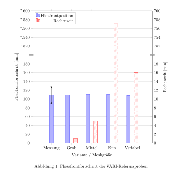
ich bin gerade dabei zwei unterschiedliche Balkendiagrammsätze in einen Plot zu fassen. Soweit hat das auch schon (mit dem ein oder anderen Workaround) geklappt.
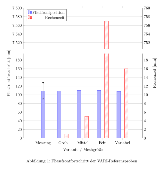
Jetzt soll aber eine Achse unterbrochen werden, um einen besonders hohen Wert abbilden zu können.
Hier mal eben meinen Code:
\begin{filecontents}{RTM_Ref_Pos.txt}
Name	x	Messung	StdMessung nix
{ }	1	109	18	0
{ }	2	109	nan	0
{ }	3	110	nan	0
{ }	4	110	nan	0
{ }	5	108	nan	0
\end{filecontents}
\begin{filecontents}{RTM_Ref_Time.txt}
Name		x	Rechenzeit
Messung		1	nan
Grob		2	1
Mittel		3	5
Fein		4	757
Variabel	5	16
\end{filecontents}


\documentclass[ngerman, listof=totoc, index=totoc,  bibliography=totocnumbered, twoside, ]{scrartcl} %draft
\usepackage{babel}
\usepackage{graphicx}
\usepackage{here}
\usepackage{pgfplots}
\usetikzlibrary{patterns}
\pgfplotsset{
	compat=1.12,
	/pgf/number format/use comma
}
\begin{document}

\begin{figure}[H] %\label{fig.:FF-RTM-REF}
   \centering
   \begin{tikzpicture}
   \begin{axis}[
   ybar=10pt,  %configures bar shift
   bar width = 10pt,
   ymax=240,
   ymin=0,
   enlarge x limits=0.25,
   ylabel={Fließfrontfortschritt [mm]},
   width=0.9\linewidth, %  regelt die BREITE
   height=10cm, % regelt die HÖHE
   ytick={0,20,...,240},
   xticklabels from table={RTM_Ref_Pos.txt}{Name},
   xtick=data,
   ticklabel style={/pgf/number format/.cd, use comma, 1000 sep = {}},
   ymajorgrids=true,
   legend pos= north west,% Legende oben links in Abb.
   legend cell align=right% Rechtsbündige Ausrichtung der Legende
   ]
%-------------------------- linker Datensatz --------------------------------
   \addplot
   [draw = blue,
   fill = blue!30!white,
   error bars/.cd,
   y dir=both,
   y explicit,
   error mark=triangle*,
   error bar style={color=black}]
   table[
   x=x,
   y=Messung,
   y error=StdMessung,
   visualization depends on=\thisrow{StdMessung} \as \myshift,
   ]
   {RTM_Ref_Pos.txt};
   \addlegendentry{Fließfrontposition};
%-----------------------------Platzhalter ----------------------------------
   \addplot
   [draw = red,
   fill=white,
   postaction={pattern=north east lines,pattern color=red!30!white},
   error bars/.cd,
   y dir=both,
   y explicit,
   error mark=triangle*,
   error bar style={color=black}]
   table[
   x=x,
   y=nix,
   ]
   {RTM_Ref_Pos.txt};
   \addlegendentry{Rechenzeit};
%----------------------------------------------------------------------------
   \end{axis}
%------------------------------ Beginn rechte Balken--------------------------
   \begin{axis}[
   ybar=15pt,  %configures bar shift
   bar width = 10pt,
   yticklabel pos=right,
   ymax=24,
   ymin=0,
   ytick={0,2,...,24},
   enlarge x limits=0.25,
   ylabel={Rechenzeit [min]},
   xlabel={Variante / Meshgröße},
   width=0.9\linewidth, %  regelt die BREITE
   height=10cm, % regelt die HÖHE
   xticklabels from table={RTM_Ref_Time.txt}{Name},
   xtick=data,
   ticklabel style={/pgf/number format/.cd, use comma, 1000 sep = {}},
   ymajorgrids=false,
   legend pos= north east,% Legende oben links in Abb.
   legend cell align=right% Rechtsbündige Ausrichtung der Legende
   ]
%-----------------------------Platzhalter ------------------------------
   \addplot
   [draw = blue,
   fill = blue!30!white,
   error bars/.cd,
   y dir=both,
   y explicit,
   error mark=triangle*,
   error bar style={color=black}]
   table[
   x=x,
   y=nix,
   ]
   {RTM_Ref_Pos.txt};
%----------------------------------------------------------------------

%--------------------------------rechter Datensatz---------------------
   \addplot
   [draw = red,
   fill=white,
   postaction={pattern=north east lines,pattern color=red!30!white},
   error bars/.cd,
   y dir=both,
   y explicit,
   error mark=triangle*,
   error bar style={color=black}]
   table[
   x=x,
   y=Rechenzeit,
   ]
   {RTM_Ref_Time.txt};
   \end{axis}
%---------------------------------------------------------------------------

   \end{tikzpicture}
   \caption{Fliessfrontfortschritt der VARI-Referenzproben}
   \label{fig.:FF-RTM-REF}
\end{figure}
\end{document}
Da ich mittlerweile nicht mehr weiter weiß, hoffe ich echt auf eure Hilfe.
Beste Grüße,
Grigi
PS: Ein nettes Gimmick wäre es, wenn die "Messung" in die Mitte der Sektion rutscht
Edit: Minimalbeispiel angepasst