von Powerhansi » Mo 15. Feb 2021, 07:38
Hallo zusammen,
Ich habe folgendes Problem und komme leider auf keine Lösung. Vielleicht könnt ihr mir ja helfen.
Mit Hilfe von PGF- Plots habe ich eine Grafik erstellt mit 3y-Achsen. Das funktioniert alles soweit gut. Nur leider schneidet mein eingefügtes Grid die Plots was ziemlich hässlich aussieht.
Wie kann ich das Grid hinter den Plot legen?
Ich habe ein Bild und ein MWE beigefügt, sodass ihr wisst was ich meine.
Vielen Dank für die Hilfe! 
\documentclass[
11pt,																				% Schriftgröße
a4paper,																		% Seitenformat
DIV = 12,																			% Satzspiegel
twoside,																		% zweiseitig
parskip=half, 																	% Absatzabstand
bibliography=totoc,
openany,															% Neues Kapitel rechts
cleardoublepage=empty,									% Einschub einer Vakatseite bei neuem Kapitel
]{scrbook}

\usepackage{tikz}
\usepackage{pgfplots}									% Package für PGF Plots
\pgfplotsset{compat=1.12}
\usepackage{geometry}

\begin{document}

\definecolor{Plotfarbe1}{rgb}{0.33, 0.33, 0.33}
\definecolor{Plotfarbe2}{rgb}{0.66,0.66,0.66}
\definecolor{Plotfarbe3}{rgb}{0,0,0}
\pgfplotstableread{
	%Iteration			%Strom			%Verlustleistung 		%Widerstand
	X   				Y1          	Y2          			Y3

	1   				85.714 			7.92   				 	0.54

	2   				187.03    		17.28   			 	0.247

	3   				212.45    		19.67    				0.218

	4   				163.5    		15.13    				0.283

	5   				208.48    		19.28    				0.2218
	6   				182.36    		16.89    				0.254

	7   				205.03    		19.0 					0.226

	8   				194.08    		17.92    				0.238

	9  					201.05    		18.60    				0.230

	10 					198.09    		18.28    				0.233

	11  				200.45    		18.48   	 			0.230

}\datatable

\pgfplotsset{
	scale only axis,
	tick align = outside,
	grid=both,
	%minor grid style={gray!25},
	%major grid style={gray!25},
	y tick label style={/pgf/number format/.cd,fixed,
		%fixed zerofill,
		precision=2,/tikz/.cd},
}

\begin{tikzpicture}
% Plot Strom
\begin{axis}[
xtick={1,...,11},
xlabel={Iterationen},
ylabel={Strom in A},
ymin=0, ymax=250,
ytick={0,50,...,250},
y axis line style={Plotfarbe3},
ytick style={Plotfarbe3},
yticklabel style=Plotfarbe3,
axis x line*=bottom,
axis y line*=left,
]
\addplot [
color=Plotfarbe1,
solid,
line width=1.5pt,
mark size=2pt,
mark=square*,
mark options={solid}
] table [x=X, y=Y1]{\datatable};
\label{plot1}
\end{axis}

% Gesamtverluste
\begin{axis}[
color=Plotfarbe3,
scale only axis,
ymin=7,
ymax=22,
ytick={7,10,...,22},
axis x line*=none,
axis y line*=left,
ylabel={Verlustleistung in W},
ylabel style=black,
hide x axis,
every outer y axis line/.style={xshift=-2cm},
every tick/.style={xshift=-2cm},
every y tick label/.append style={xshift=-2cm}
]
\addplot [
color=Plotfarbe2,
solid,
line width=1.5pt,
mark size=2pt,
mark=*,
mark options={solid,fill=Plotfarbe2}]
table [x=X, y=Y2]{\datatable};
\label{plot2}
\end{axis}

% Widerstand
\begin{axis}[
scale only axis,
ymin=0.1,
ymax=0.6,
ytick={0.1,0.2,...,0.6},
axis x line*=none,
axis y line*=right,
ylabel={Widerstand in m$\Omega$},
ylabel style=black,
hide x axis,
every outer y axis line/.style={Plotfarbe3,xshift=0cm},
every tick/.style={Plotfarbe3,xshift=0cm},
every y tick label/.append style={Plotfarbe3,xshift=0cm},
legend style={at={(0.5,-0.2)},
	anchor=north,legend columns=1}
]

\addlegendimage{refstyle=plot1} \addlegendentry{Leiterstrom in A}
\addlegendimage{refstyle=plot2} \addlegendentry{Gesamte Verlustleistung in W}

\addplot [
color=Plotfarbe3,
line width=1.5pt,
mark size=2pt,
mark=triangle*,
mark options={solid,,rotate=270,fill=Plotfarbe3}]
table [x=X, y=Y3]{\datatable};
\addlegendentry{Leitungswiderstand in m$\Omega$}
\end{axis}

\end{tikzpicture}%

\end{document}
- Dateianhänge
-
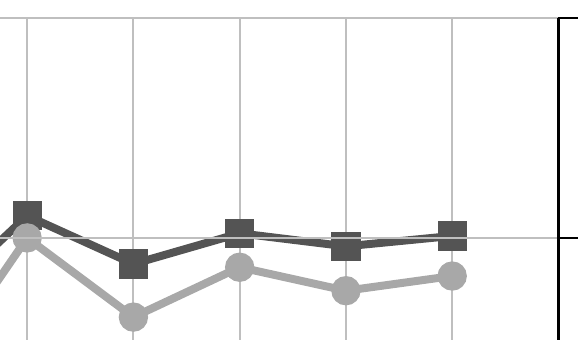
- Grid Problem
- Grid_problem.PNG (8.78 KiB) 2735 mal betrachtet
Hallo zusammen,
Ich habe folgendes Problem und komme leider auf keine Lösung. Vielleicht könnt ihr mir ja helfen.
Mit Hilfe von PGF- Plots habe ich eine Grafik erstellt mit 3y-Achsen. Das funktioniert alles soweit gut. Nur leider schneidet mein eingefügtes Grid die Plots was ziemlich hässlich aussieht.
Wie kann ich das Grid hinter den Plot legen?
Ich habe ein Bild und ein MWE beigefügt, sodass ihr wisst was ich meine.
Vielen Dank für die Hilfe! :D
[code]
\documentclass[
11pt, % Schriftgröße
a4paper, % Seitenformat
DIV = 12, % Satzspiegel
twoside, % zweiseitig
parskip=half, % Absatzabstand
bibliography=totoc,
openany, % Neues Kapitel rechts
cleardoublepage=empty, % Einschub einer Vakatseite bei neuem Kapitel
]{scrbook}
\usepackage{tikz}
\usepackage{pgfplots} % Package für PGF Plots
\pgfplotsset{compat=1.12}
\usepackage{geometry}
\begin{document}
\definecolor{Plotfarbe1}{rgb}{0.33, 0.33, 0.33}
\definecolor{Plotfarbe2}{rgb}{0.66,0.66,0.66}
\definecolor{Plotfarbe3}{rgb}{0,0,0}
\pgfplotstableread{
%Iteration %Strom %Verlustleistung %Widerstand
X Y1 Y2 Y3
1 85.714 7.92 0.54
2 187.03 17.28 0.247
3 212.45 19.67 0.218
4 163.5 15.13 0.283
5 208.48 19.28 0.2218
6 182.36 16.89 0.254
7 205.03 19.0 0.226
8 194.08 17.92 0.238
9 201.05 18.60 0.230
10 198.09 18.28 0.233
11 200.45 18.48 0.230
}\datatable
\pgfplotsset{
scale only axis,
tick align = outside,
grid=both,
%minor grid style={gray!25},
%major grid style={gray!25},
y tick label style={/pgf/number format/.cd,fixed,
%fixed zerofill,
precision=2,/tikz/.cd},
}
\begin{tikzpicture}
% Plot Strom
\begin{axis}[
xtick={1,...,11},
xlabel={Iterationen},
ylabel={Strom in A},
ymin=0, ymax=250,
ytick={0,50,...,250},
y axis line style={Plotfarbe3},
ytick style={Plotfarbe3},
yticklabel style=Plotfarbe3,
axis x line*=bottom,
axis y line*=left,
]
\addplot [
color=Plotfarbe1,
solid,
line width=1.5pt,
mark size=2pt,
mark=square*,
mark options={solid}
] table [x=X, y=Y1]{\datatable};
\label{plot1}
\end{axis}
% Gesamtverluste
\begin{axis}[
color=Plotfarbe3,
scale only axis,
ymin=7,
ymax=22,
ytick={7,10,...,22},
axis x line*=none,
axis y line*=left,
ylabel={Verlustleistung in W},
ylabel style=black,
hide x axis,
every outer y axis line/.style={xshift=-2cm},
every tick/.style={xshift=-2cm},
every y tick label/.append style={xshift=-2cm}
]
\addplot [
color=Plotfarbe2,
solid,
line width=1.5pt,
mark size=2pt,
mark=*,
mark options={solid,fill=Plotfarbe2}]
table [x=X, y=Y2]{\datatable};
\label{plot2}
\end{axis}
% Widerstand
\begin{axis}[
scale only axis,
ymin=0.1,
ymax=0.6,
ytick={0.1,0.2,...,0.6},
axis x line*=none,
axis y line*=right,
ylabel={Widerstand in m$\Omega$},
ylabel style=black,
hide x axis,
every outer y axis line/.style={Plotfarbe3,xshift=0cm},
every tick/.style={Plotfarbe3,xshift=0cm},
every y tick label/.append style={Plotfarbe3,xshift=0cm},
legend style={at={(0.5,-0.2)},
anchor=north,legend columns=1}
]
\addlegendimage{refstyle=plot1} \addlegendentry{Leiterstrom in A}
\addlegendimage{refstyle=plot2} \addlegendentry{Gesamte Verlustleistung in W}
\addplot [
color=Plotfarbe3,
line width=1.5pt,
mark size=2pt,
mark=triangle*,
mark options={solid,,rotate=270,fill=Plotfarbe3}]
table [x=X, y=Y3]{\datatable};
\addlegendentry{Leitungswiderstand in m$\Omega$}
\end{axis}
\end{tikzpicture}%
\end{document}
[/code]