von StefanB » Mi 2. Mär 2016, 19:04
Hallo,
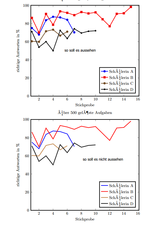
ich habe ein kleines Problem beim Plotten von Liniendiagrammen
Wenn ich die Linien mittels einer Schleife plotte, werden "alle Werte" als Punkte eintragen.
Wenn ich jedoch die Linienfarbe selber festlegen will, dann werden "alle Werte" nicht mehr als Punkte eingetragen, sondern nur noch als Linien ohne Punkte.
\begin{filecontents*}{alleStatsf.csv}
Tag;A;B;C;D
1;75;86.1789;60.396;70.9677
2;67.7966;70;59.8039;53.8462
3;83.5714;90.5405;71.4286;60
4;87.3563;78.5714;73.1707;50
5;86.6667;93.3649;66.6667;72.3404
6;84.0909;91.7197;70.9677;63.4615
7;70.1754;89.1566;;74.1379
8;;92.5926;;69.4779
9;;91.0345;;71.4286
10;;92.2222;;72
11;;84.6154;;
12;;76.9231;;
13;;90.625;;
14;;91.2281;;
15;;98.1818;;
\end{filecontents*}
\documentclass[10pt,a4paper]{article}
\usepackage[latin1]{inputenc}
\usepackage{amsmath}
\usepackage{amsfonts}
\usepackage{amssymb}
\usepackage{graphicx}
\usepackage{pgfplots}
\pgfplotsset{compat=1.13}
\begin{document}
%So soll es aussehen
\begin{tikzpicture}
  \begin{axis}[
      %width=0.9\textwidth,height=0.9\textheight,
      width=0.9\textwidth,
      title={über 500 gelöste Aufgaben},
      table/col sep=semicolon,
      xlabel={Stichprobe},
      ylabel={richtige Antworten in \%},
      ymin=0, ymax=100,
      xmin=1, xmax=16,
      enlarge x limits=0.01,
      legend entries={Schülerin A, Schülerin B, Schülerin C, Schülerin D, Schülerin E},
      legend pos=south east,
      line width =1.5pt
    ]
    \pgfplotsinvokeforeach{1,...,4}{
      \addplot table [y index=#1]{alleStatsf.csv};
    }
  \end{axis}
\end{tikzpicture}
%So soll es NICHT aussehen
\begin{tikzpicture}
\begin{axis}[
%width=0.9\textwidth,height=0.9\textheight,
width=0.9\textwidth,
title={über 500 gelöste Aufgaben},
table/col sep=semicolon,
xlabel={Stichprobe},
ylabel={richtige Antworten in \%},
ymin=0, ymax=100,
xmin=1, xmax=16,
enlarge x limits=0.01,
legend entries={Schülerin A, Schülerin B, Schülerin C, Schülerin D, Schülerin E},
legend pos=south east,
line width =1.5pt
]
	\addplot[blue] table [y index=1]{alleStatsf.csv};
	\addplot[red] table [y index=2]{alleStatsf.csv};
	\addplot[brown] table [y index=3]{alleStatsf.csv};
	\addplot[black] table [y index=4]{alleStatsf.csv};
\end{axis}
\end{tikzpicture}
\end{document}
Siehe dazu das Bild
- Dateianhänge
-
- Punkte.PNG (69.11 KiB) 2222 mal betrachtet
Hallo,
ich habe ein kleines Problem beim Plotten von Liniendiagrammen
Wenn ich die Linien mittels einer Schleife plotte, werden "alle Werte" als Punkte eintragen.
Wenn ich jedoch die Linienfarbe selber festlegen will, dann werden "alle Werte" nicht mehr als Punkte eingetragen, sondern nur noch als Linien ohne Punkte.
[code]
\begin{filecontents*}{alleStatsf.csv}
Tag;A;B;C;D
1;75;86.1789;60.396;70.9677
2;67.7966;70;59.8039;53.8462
3;83.5714;90.5405;71.4286;60
4;87.3563;78.5714;73.1707;50
5;86.6667;93.3649;66.6667;72.3404
6;84.0909;91.7197;70.9677;63.4615
7;70.1754;89.1566;;74.1379
8;;92.5926;;69.4779
9;;91.0345;;71.4286
10;;92.2222;;72
11;;84.6154;;
12;;76.9231;;
13;;90.625;;
14;;91.2281;;
15;;98.1818;;
\end{filecontents*}
\documentclass[10pt,a4paper]{article}
\usepackage[latin1]{inputenc}
\usepackage{amsmath}
\usepackage{amsfonts}
\usepackage{amssymb}
\usepackage{graphicx}
\usepackage{pgfplots}
\pgfplotsset{compat=1.13}
\begin{document}
%So soll es aussehen
\begin{tikzpicture}
\begin{axis}[
%width=0.9\textwidth,height=0.9\textheight,
width=0.9\textwidth,
title={über 500 gelöste Aufgaben},
table/col sep=semicolon,
xlabel={Stichprobe},
ylabel={richtige Antworten in \%},
ymin=0, ymax=100,
xmin=1, xmax=16,
enlarge x limits=0.01,
legend entries={Schülerin A, Schülerin B, Schülerin C, Schülerin D, Schülerin E},
legend pos=south east,
line width =1.5pt
]
\pgfplotsinvokeforeach{1,...,4}{
\addplot table [y index=#1]{alleStatsf.csv};
}
\end{axis}
\end{tikzpicture}
%So soll es NICHT aussehen
\begin{tikzpicture}
\begin{axis}[
%width=0.9\textwidth,height=0.9\textheight,
width=0.9\textwidth,
title={über 500 gelöste Aufgaben},
table/col sep=semicolon,
xlabel={Stichprobe},
ylabel={richtige Antworten in \%},
ymin=0, ymax=100,
xmin=1, xmax=16,
enlarge x limits=0.01,
legend entries={Schülerin A, Schülerin B, Schülerin C, Schülerin D, Schülerin E},
legend pos=south east,
line width =1.5pt
]
\addplot[blue] table [y index=1]{alleStatsf.csv};
\addplot[red] table [y index=2]{alleStatsf.csv};
\addplot[brown] table [y index=3]{alleStatsf.csv};
\addplot[black] table [y index=4]{alleStatsf.csv};
\end{axis}
\end{tikzpicture}
\end{document}
[/code]
Siehe dazu das Bild