von elmar.a » Mo 25. Jun 2012, 18:52
Hi,
seit längerem versuche ich einen Teil eines Plots farbig zu hinterlegen. Da in der endgültigen Grafik mehrere Plots nebeneinander gesetzt werden, soll der hinterlegte Abschnitt sich durch alle Plots durchziehen -- er soll also über xmax hinausgehen.
Mein Code sieht momentan wie folgt aus:
\documentclass{minimal}

\usepackage{tikz}														% graphic compiler
\usepackage{pgfplots}												% plotting of data (based on TikZ)

\pgfplotsset{compat=1.5.1}
\usetikzlibrary{calc}


\begin{document}


\begin{tikzpicture}
	\begin{axis}[
			name=plot1,
			height=.6\textheight, width=.23\textwidth,
			axis on top,
			% x axis
			xlabel={RC11-120},
			xlabel near ticks,
			xmin=0, xmax=16,
			xticklabel pos=right,
			% y axis
			ylabel={Age [ka]},
			y dir=reverse,
			ymin=0, ymax=250,
			ytick={0,50,...,250},
			minor y tick num=4,
			]
	\draw[
			draw=lightgray!30!white,
			fill=lightgray!30!white]
			\pgfextra{\pgfpathrectangle{
					\pgfplotspointaxisxy{0}{15}}
					{\pgfplotspointaxisdirectionxy{20}{19}}
					};
	\addplot+[
			no marks, color=black,
			] table[
			x=C. davisiana,
			y=Age,
			header=has colnames,
			col sep=semicolon,
			row sep=newline,
			] {rc11120_ageLR_depthCd.csv};
	\end{axis}
	\begin{axis}[
			name=plot2,
			at={($(plot1.east)+(.02\textwidth,0)$)},
			anchor=west,
			height=.6\textheight, width=.23\textwidth,
			axis on top,
			% x axis
			xlabel={PS2082-1},
			xlabel near ticks,
			xmin=0, xmax=25,
			xticklabel pos=right,
			% y axis
			y dir=reverse,
			ymin=0, ymax=250,
			ytick={0,50,...,250},
			minor y tick num=4,
			yticklabels=\empty,
			]
	\addplot+[
			no marks,
			color=black,
			] table[
			x=C. davisiana,
			y=Age,
			header=has colnames,
			col sep=semicolon,
			row sep=newline,
			] {ps20821_ageLR_depthCd.csv};
	\end{axis}
\end{tikzpicture}


\end{document}
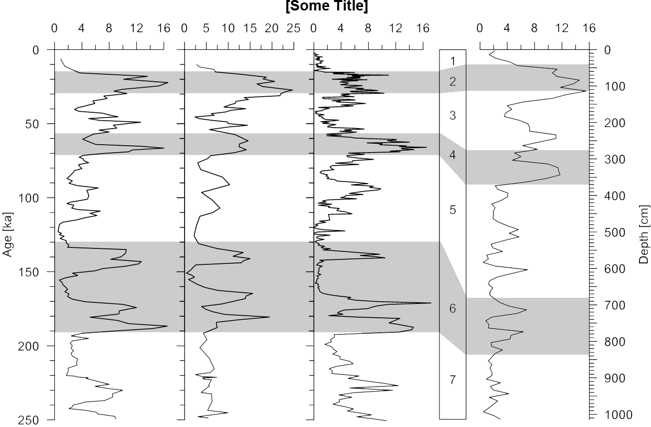
Aussehen soll das Ganze später in etwa wie die Graphik im Anhang (erstellt mit Grapher 8)....
Ist dies möglich? Wenn ja, wie?
Gruß und besten Dank!
- Dateianhänge
-
- example.png (122.65 KiB) 3474 mal betrachtet
Hi,
seit längerem versuche ich einen Teil eines Plots farbig zu hinterlegen. Da in der endgültigen Grafik mehrere Plots nebeneinander gesetzt werden, soll der hinterlegte Abschnitt sich durch alle Plots durchziehen -- er soll also über xmax hinausgehen.
Mein Code sieht momentan wie folgt aus:
[code]
\documentclass{minimal}
\usepackage{tikz} % graphic compiler
\usepackage{pgfplots} % plotting of data (based on TikZ)
\pgfplotsset{compat=1.5.1}
\usetikzlibrary{calc}
\begin{document}
\begin{tikzpicture}
\begin{axis}[
name=plot1,
height=.6\textheight, width=.23\textwidth,
axis on top,
% x axis
xlabel={RC11-120},
xlabel near ticks,
xmin=0, xmax=16,
xticklabel pos=right,
% y axis
ylabel={Age [ka]},
y dir=reverse,
ymin=0, ymax=250,
ytick={0,50,...,250},
minor y tick num=4,
]
\draw[
draw=lightgray!30!white,
fill=lightgray!30!white]
\pgfextra{\pgfpathrectangle{
\pgfplotspointaxisxy{0}{15}}
{\pgfplotspointaxisdirectionxy{20}{19}}
};
\addplot+[
no marks, color=black,
] table[
x=C. davisiana,
y=Age,
header=has colnames,
col sep=semicolon,
row sep=newline,
] {rc11120_ageLR_depthCd.csv};
\end{axis}
\begin{axis}[
name=plot2,
at={($(plot1.east)+(.02\textwidth,0)$)},
anchor=west,
height=.6\textheight, width=.23\textwidth,
axis on top,
% x axis
xlabel={PS2082-1},
xlabel near ticks,
xmin=0, xmax=25,
xticklabel pos=right,
% y axis
y dir=reverse,
ymin=0, ymax=250,
ytick={0,50,...,250},
minor y tick num=4,
yticklabels=\empty,
]
\addplot+[
no marks,
color=black,
] table[
x=C. davisiana,
y=Age,
header=has colnames,
col sep=semicolon,
row sep=newline,
] {ps20821_ageLR_depthCd.csv};
\end{axis}
\end{tikzpicture}
\end{document}
[/code]
Aussehen soll das Ganze später in etwa wie die Graphik im Anhang (erstellt mit Grapher 8)....
Ist dies möglich? Wenn ja, wie?
Gruß und besten Dank!