
Hallo zusammen,
wie im Titel erwähnt möchte ich gern einen Ausschnitt eines Plots vergrößern, allerdings ohne die Größe der Marker oder Linien im Plot zu verändern. Dies ist nötig, da in einem Bereich Punkte sehr nah beinander sind, allerdings deren minimale Abweichung sichtbar werden muss. Unglücklicherweise überlagern sich die Punkte schon bei moderaten Markergrößen so stark, dass man keine Unterschiede mehr erkennen kann.
Zum Thema habe ich bereits folgenden Ansatz gefunden:
http://tex.stackexchange.com/questions/ ... -mark-size
Qrrbrbirlbel hat es hier geschafft die Linienbreite innerhalb der Vergrößerung so wie im Plot zu halten. Allerdings wird hier der Marker (x) noch immer skaliert. Hat jemand eine Idee wie man das beheben könnte? Idealerweise würde er dafür den verlinkten Code nutzen.
Vielen Dank und beste Grüße,
Münzi
Plot vergrößern bei konstanter Marker-Size

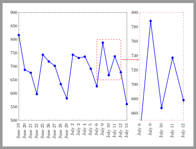
Falls Du die Daten als Datei vorliegen hast, kannst Du auch zwei groupplots nebeneinander setzen. Da Du kein eigenes Minimalbeispiel angegeben hast, verwende ich jetzt einfach ein Beispiel aus irgendeiner früheren Antwort von mir, dass ich nur noch etwas angepasst habe:
Gruß
Elke
\documentclass[margin=5mm]{standalone}
%%%<
% Example data
\begin{filecontents*}{data.csv}
  Number   Orders   Day
  1   816   June\ 19
  2   687   June\ 20
  3   676   June\ 21
  4   597   June\ 22
  5   743   June\ 25
  6   718   June\ 26
  7   702   June\ 27
  8   634   June\ 28
  9   581   June\ 29
  10   743   July\ 2
  11   731   July\ 3
  12   736   July\ 4
  13   691   July\ 5
  14   626   July\ 6
  15   788   July\ 9
  16   667   July\ 10
  17   737   July\ 11
  18   678   July\ 12
  19   560   July\ 13
\end{filecontents*}
%%%>
\usepackage{pgfplots}
\pgfplotsset{compat=1.12}
\usepackage{pgfplotstable}
\usepgfplotslibrary{groupplots}
\begin{document}
\begin{tikzpicture}
  % Read the file
  % if needed, define column separators by pgfplotstableread[col sep=...]{}{}
 \pgfplotstableread{data.csv}{\Data}
 \begin{groupplot}[
     group style = {group size = 2 by 1},
     height = 10cm,
     width = 10cm,
     ymin = 500,
     xticklabels from table = {\Data}{Day}, xtick = {1,...,19},
     xticklabel style = {rotate = 90, xshift = -0.8ex, anchor = mid east}
    ]
    \nextgroupplot[xmin = 1, xmax = 19, ymax = 900]
      \addplot+[very thick] table [x = Number, y = Orders] {\Data};
      \draw[red, dashed, thick] (14,650) rectangle (18,800);
      \coordinate(s) at (18,725);
    \nextgroupplot[xmin = 14, xmax = 18, ymin=650, ymax = 800, width = 5cm,axis line style={red,dashed}]
      \addplot+[very thick] table [x = Number, y = Orders] {\Data};
  \end{groupplot}
  \draw[thick, red, ->, shorten >=2pt, shorten <=2pt] (s)
  -- (s-|group c2r1.west);
\end{tikzpicture}
\end{document}
Elke
- Dateianhänge
-
- gl_plotausschnitt.png (22.56 KiB) 1866 mal betrachtet
Hallo Elke,
vielen Dank für deine Hilfe. Für ein anderes Diagramm habe ich das tatsächlich sogar schon einmal gemacht. Leider funktioniert dein Vorschlag hier aber nicht. Was ich nicht dazu geschrieben hatte um das Thema einfach zu halten, deine Lösung aber nicht ganz praktikabel macht, ist dass es sich um ein Dreiecksdiagramm (ternaryaxis) handelt. Ein Beispiel nach http://pgfplots.sourceforge.net/gallery.html sieht so aus.
Die Aufgabe wäre jetzt beispielsweise das rechte Minimum der roten Kurve mit ihren zwei benachbarten Punkten entsprechend eines spy-Befehls zu vergrößern. Dabei sollten die Linien und Punkte ihre Größe behalten, wodurch die räumliche Trennung der Punkte deutlicher wird (notwendig, da bei mir 6 Punkte sehr nah an einem ähnlichen Minimum liegen deren Trennung aber elementar für die Bestätigung einer Hypothese ist).
vielen Dank für deine Hilfe. Für ein anderes Diagramm habe ich das tatsächlich sogar schon einmal gemacht. Leider funktioniert dein Vorschlag hier aber nicht. Was ich nicht dazu geschrieben hatte um das Thema einfach zu halten, deine Lösung aber nicht ganz praktikabel macht, ist dass es sich um ein Dreiecksdiagramm (ternaryaxis) handelt. Ein Beispiel nach http://pgfplots.sourceforge.net/gallery.html sieht so aus.
\documentclass{article}
% translate with >> pdflatex -shell-escape <file>

% This file is an extract of the PGFPLOTS manual, copyright by Christian Feuersaenger.
%
% Feel free to use it as long as you cite the pgfplots manual properly.
%
% See
%   http://pgfplots.sourceforge.net/pgfplots.pdf
% for the complete manual.
%
% Any required input files (for <plot table> or <plot file> or the table package) can be downloaded
% at
% http://www.ctan.org/tex-archive/graphics/pgf/contrib/pgfplots/doc/latex/
% and
% http://www.ctan.org/tex-archive/graphics/pgf/contrib/pgfplots/doc/latex/plotdata/

\usepackage{pgfplots}
\pgfplotsset{compat=newest}

\pagestyle{empty}

\usepgfplotslibrary{ternary}

\begin{document}
\begin{tikzpicture}
\begin{ternaryaxis}[
	title=Sloped labels and minor ticks,
	xlabel=Water,
	ylabel=D--Threonine,
	zlabel=L--Threonine,
	label style={sloped},
	minor tick num=2,
]
	\addplot3 coordinates {
        (0.82,  0.18,  0.00)
        (0.75,  0.17,  0.08)
        (0.77,  0.12,  0.11)
        (0.75,  0.08,  0.17)
        (0.81,  0.00,  0.19)
	};
	\addplot3 coordinates {
        (0.75,  0.25,  0.00)
        (0.69,  0.25,  0.06)
        (0.64,  0.24,  0.12)
        (0.655, 0.23,  0.115)
        (0.67,  0.17,  0.16)
        (0.66,  0.12,  0.22)
        (0.64,  0.11,  0.25)
        (0.69,  0.05,  0.26)
        (0.76,  0.01,  0.23)
	};
\end{ternaryaxis}
\end{tikzpicture}
\end{document}