PGFPlot y Skala logarithmisch aber normale werte anzeigen Thema ist als GELÖST markiert

Tabellen und Grafiken erstellen und anordnen


MrsTudore

PGFPlot y Skala logarithmisch aber normale werte anzeigen

Beitrag von MrsTudore »

Hallo.

Ich habe folgende Aufgabenstellung.

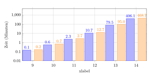
Ich habe ein Diagramm, dass mit einer logarithmischen Y-Skala besser zu erkennen ist.
Jedoch haben meine Kollegen gemeint ich sollte statt der logarithmischen Werte wie zB 10^2 etc. lieber den normalen Wert hinschreiben.
Im angehängten Bild sieht man wie es jetzt aussieht (jetzt.png).
und ziel.png zeigt was ich haben will.


Habe in der doku nichts gefunden, womit ich zwar die Werte logarithmieren kann, jedoch die Skala mit den richtigen (normalen) Werte anzeigen kann.

Ist das möglich?

\documentclass[10pt,a4paper]{article}
\usepackage[latin1]{inputenc}

\usepackage{pgfplots}
\pgfplotsset{width=\textwidth,height=6cm,compat=1.9}
\pgfplotsset{/pgf/number format/read comma as period}
\begin{filecontents}{test.dat}
	XOR		UN			UO			
	9		0,1464		0,1658	
	10		0,5522		0,6937	
	11		2,3192		2,6957	
	12		10,6797		12,7331	
	13		79,5394		94,9720	
	14		406,1020	468,6611	
\end{filecontents}
\begin{document}
\pgfplotstableread{test.dat}{\test}
\begin{tikzpicture}
      \begin{axis}[
		ybar=8pt,
		bar width=20pt,
		xlabel=xlabel,
		ylabel=Zeit (Minuten),
	        grid=major,
		ymode = log,
		log origin=infty,
               xtick=data,
		minor y tick num=2,
		xmin=8.5, xmax=14.5,
		ymin=0, ymax=533,
		every node near coord/.append style={
			/pgf/number format/fixed zerofill,
			/pgf/number format/precision=2
		}
	]
	\addplot[blue,fill=blue!30,nodes near coords] table[x=XOR,y=UN] {\test};
	\addplot+[orange,fill=orange!30,nodes near coords,ybar] table[x=XOR,y=UO] {\test};
				

	\end{axis}
\end{tikzpicture}
\end{document}
[/img]
Dateianhänge
jetzt.PNG
jetzt.PNG (15.46 KiB) 2349 mal betrachtet
Ziel.PNG
Ziel.PNG (17.59 KiB) 2353 mal betrachtet

esdd
Forum-Meister
Forum-Meister
Beiträge: 2561
Registriert: So 7. Feb 2010, 16:36

Beitrag von esdd »

Wenn Du an der y-Achse statt beispielsweise 10^1 lieber 10 stehen haben möchtest, dann geht das mit
\pgfplotsset{
  /pgfplots/log number format basis/.code 2 args={%
    ${\pgfmathparse{#1^#2}\pgfmathprintnumber[fixed,precision=2]{\pgfmathresult}}$%
}}% Ausgabe von beispielsweise 100 statt 10^2 an logarithmischen Achsen
Allerdings verstehe ich nicht ganz, warum in Deiner Skizze an der Stelle 237 oder 2.37 als gewünschter Wert steht.

Vielleicht meinen Deine Kollegen auch die Zahlenwerte an den Balken. Bei denen wäre es sicher wirklich sinnvoll die ursprünglichen [y]-Werte anzugeben. Das erreicht man hier mit
point meta=rawy% <- Angabe ursprünglicher y-Werte
Bild

Code:
\begin{filecontents*}{test.dat} 
    XOR      UN         UO         
    9      0,1464      0,1658   
    10      0,5522      0,6937   
    11      2,3192      2,6957   
    12      10,6797      12,7331   
    13      79,5394      94,9720   
    14      406,1020   468,6611   
\end{filecontents*} 

\documentclass[10pt,a4paper]{article} 
\usepackage[latin1]{inputenc} 

\usepackage{pgfplots}
\pgfplotsset{compat=1.9}% immer als erstes setzen, aktuell wäre 1.14
\pgfplotsset{width=\textwidth,height=6cm} 
\pgfplotsset{/pgf/number format/read comma as period} 

\pgfplotsset{
  /pgfplots/log number format basis/.code 2 args={%
    ${\pgfmathparse{#1^#2}\pgfmathprintnumber[fixed,precision=2]{\pgfmathresult}}$%
}}% Ausgabe von beispielsweise 100 statt 10^2 an logarithmischen Achsen

\begin{document} 
\pgfplotstableread{test.dat}{\test} 
\begin{tikzpicture} 
  \begin{axis}[ 
       ybar=8pt, 
       bar width=20pt, 
       xlabel=xlabel, 
       ylabel=Zeit (Minuten), 
       grid=major, 
       ymode = log, 
       log origin=infty, 
       xtick=data, 
       %minor y tick num=2,% kein Effekt bei logarithmischer Achse
       xmin=8.5, xmax=14.5, 
       %ymin=0,% <- das macht bei logarithmischer Achse keinen Sinn
       ymin=.01,
       ymax=5000, 
       every node near coord/.append style={ 
          /pgf/number format/fixed,
          /pgf/number format/fixed zerofill, 
          /pgf/number format/precision=1 
       }, 
      nodes near coords,% <- kann hier für alle Plots gesetzt werden
      point meta=rawy% <- Angabe ursprünglicher y-Werte
    ] 
    \addplot[blue,fill=blue!30] table[x=XOR,y=UN] {\test}; 
    \addplot+[orange,fill=orange!30] table[x=XOR,y=UO] {\test}; 
  \end{axis} 
\end{tikzpicture} 
\end{document} 
Dateianhänge
gl_logpointmeta.png
gl_logpointmeta.png (19.69 KiB) 2324 mal betrachtet

markusv
Forum-Meister
Forum-Meister
Beiträge: 947
Registriert: Do 3. Sep 2015, 17:20
Wohnort: Leipzig

Beitrag von markusv »

Du kannst mit ytick={num1,num2,num3,...} selbst definieren, welche Zahlen angezeigt werden sollen.
Mit yticklabels={num1,num2,num3,...} kannst du einstellen, welche Bezeichnung diese Zahlen erhalten.

Kombinierst du also beides, erhälst du:
\documentclass[10pt,a4paper]{article}
\usepackage[latin1]{inputenc}

\usepackage{pgfplots}
\pgfplotsset{width=\textwidth,height=6cm,compat=1.9}
\pgfplotsset{/pgf/number format/read comma as period}
\begin{filecontents}{test.dat}
   XOR      UN         UO         
   9      0,1464      0,1658   
   10      0,5522      0,6937   
   11      2,3192      2,6957   
   12      10,6797      12,7331   
   13      79,5394      94,9720   
   14      406,1020   468,6611   
\end{filecontents}
\begin{document}
\pgfplotstableread{test.dat}{\test}
\begin{tikzpicture}
      \begin{axis}[
      ybar=8pt,
      bar width=20pt,
      xlabel=xlabel,
      ylabel=Zeit (Minuten),
           grid=major,
      ymode = log,
      log origin=infty,
               xtick=data,
      minor y tick num=2,
      xmin=8.5, xmax=14.5,
      ymin=0, ymax=533,
      ytick = {0.1,10,237,438}, %<--- ergänzt
      yticklabels={$10^{-1}$,$10^1$,237,438}, %<--- ergänzt
      every node near coord/.append style={
         /pgf/number format/fixed zerofill,
         /pgf/number format/precision=2
      }
   ]
   \addplot[blue,fill=blue!30,nodes near coords] table[x=XOR,y=UN] {\test};
   \addplot+[orange,fill=orange!30,nodes near coords,ybar] table[x=XOR,y=UO] {\test};
            

   \end{axis}
\end{tikzpicture}
\end{document}
Wäre Microsoft Word für das Schreiben von Büchern entwickelt worden,
würde es Microsoft Book heißen.

Unkomplizierte und schnelle LaTeX-Hilfe, bspw. Erstellung von Vorlagen und Bewerbungen:
Help-LaTeX@web.de

MrsTudore

Danke esdd

Beitrag von MrsTudore »

Danke.

Das war genau das was mein Kollege gemeint hat. Ich habe ihn am Anfang falsch verstanden. Aber das mit den point meta=rawy war genau das richtige.

Wenn es erlaubt ist würde ich jetzt gern noch eine Frage dazustellen.

Bräuchte noch ein diagramm im Area style (also unter der linie soll die fläche farblich markiert sein).

Nun sollen wie vorhin beide flächen gezeichnet werden und dies wenn möglich auch im log-skalierung.

Wenn ich es ohne log-skalierung mache, sieht es schon so aus wie ich es möchte, wenn ich jedoch die log-skalierung hinzufüge, sehen die Flächen nicht mehr so aus. Die beginnen nicht unten sondern irgendwo.

Bild jetzt.png zeigt wie es zurzeit mit der log-skalierung aussieht. ziel.png zeigt wie es aussehen soll hat jedoch noch keine log-skalierung.
\begin{filecontents*}{test.dat} 
    XOR      UN         UO         
    9      0,1464      0,1658   
    10      0,5522      0,6937   
    11      2,3192      2,6957   
    12      10,6797      12,7331   
    13      79,5394      94,9720   
    14      406,1020   468,6611   
\end{filecontents*} 

\documentclass[10pt,a4paper]{article} 
\usepackage[latin1]{inputenc} 

\usepackage{pgfplots} 
\pgfplotsset{compat=1.14}
\pgfplotsset{width=\textwidth,height=6cm} 
\pgfplotsset{/pgf/number format/read comma as period} 

\pgfplotsset{ 
  /pgfplots/log number format basis/.code 2 args={% 
    ${\pgfmathparse{#1^#2}\pgfmathprintnumber[fixed,precision=2]{\pgfmathresult}}$% 
}}% Ausgabe von beispielsweise 100 statt 10^2 an logarithmischen Achsen 

\begin{document} 
\pgfplotstableread{test.dat}{\test} 
\begin{tikzpicture}
\begin{axis}[
%					stack plots=y,
area style,
xlabel=Number of XORs,
ylabel=Zeit (Minuten),
legend style={at={(0.5,-0.25)},
	anchor=north,legend columns=-1},
grid=major,
ymode = log,
log origin y=infty,
enlargelimits=false,
nodes near coords,
xtick=data,
xmin=8.5, xmax=14.2,
ymin=0, ymax=533,
every node near coord/.append style={
	/pgf/number format/fixed zerofill,
	/pgf/number format/precision=2
},
point meta=rawy,% <- Angabe ursprünglicher y-Werte
]
\addplot[orange,fill=orange!30] table[x=XOR,y=UO] {\test};
\addplot[blue,fill=blue!30] table[x=XOR,y=UN] {\test};

\end{axis}
\end{tikzpicture}
\end{document}
Danke im Voraus :)
Dateianhänge
jetzt.PNG
jetzt.PNG (14.71 KiB) 2314 mal betrachtet
noch ohne log skalierung
Ziel.PNG (14.14 KiB) 2337 mal betrachtet

esdd
Forum-Meister
Forum-Meister
Beiträge: 2561
Registriert: So 7. Feb 2010, 16:36

Beitrag von esdd »

Dein MWE erzeugt nach Auskommentieren von `ymode=log` nicht das angehangene "noch ohne log Skalierung" Bild.

Es sollte mit \closedcycle in beiden Fällen funktionieren:
\addplot[orange,fill=orange!30] table[x=XOR,y=UO] {\test} \closedcycle;
\addplot[blue,fill=blue!30] table[x=XOR,y=UN] {\test} \closedcycle;
Da die beiden Graphen sehr nah beieinander liegen, sollt man dann aber nur für einen von beiden nodes near coords nutzen.

MrsTudore

Danke

Beitrag von MrsTudore »

Danke genau das was ich wollte.

Antworten