Farbe des Plot/Linie anhand x-Wert berechnen

Tabellen und Grafiken erstellen und anordnen


Orikson
Forum-Anfänger
Forum-Anfänger
Beiträge: 13
Registriert: Mo 17. Aug 2015, 21:06

Farbe des Plot/Linie anhand x-Wert berechnen

Beitrag von Orikson »

Hallo,

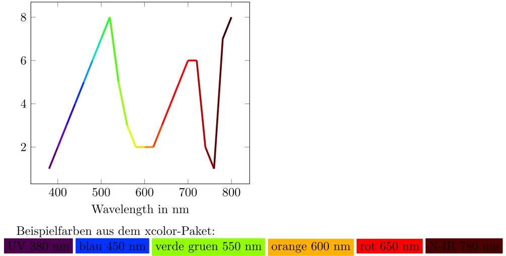
ich habe aktuell ein recht ausgefallenes Problem. Ich habe ein Diagram in welchem auf der x-Achse die Wellenlänge (~Farbe) des Lichts aufgetragen ist. Die gezeichnete Kurve soll nun die Farbe entsprechend der aktuellen Wellenlänge annehmen, wie etwa hier.

Damit es möglichst korrekt bleibt wollte ich als Farbmodell das "wave" nutzen, das aus einer Wellenläge direkt eine Farbausgabe erzeugt. Ich weiß aber nicht wie ich dies hinbekomme da ich schon an der normalen Zuweiung scheitere :roll:

Hat das schon mal jemand gemacht? Anbei mein Minimalbeispiel
\documentclass{scrreprt}

\usepackage{tikz}
\usepackage{pgfplots}
\pgfplotsset{compat=newest}   
\usepackage{xcolor}

\begin{document}

\colorbox[wave]{400}{UV 400 nm}\\
\colorbox[wave]{450}{blau 450 nm}\\
\colorbox[wave]{525}{grün 525 nm}\\
\colorbox[wave]{650}{rot 650 nm}\\
\colorbox[wave]{750}{N-IR 750 nm}\\
\colorbox[wave]{814}{IR 814 nm}\\

\begin{tikzpicture}

\begin{axis}[
	xmin = 400,
	xmax = 850,
	xlabel = {Wellenlänge $ \lambda $ in nm}
	]
	\addplot [red, ultra thick] coordinates { (400,100) (850,650) };
	%\addplot [color=[wave]{525}] coordinates { (400,100) (850,600) };	% not working
	%\addplot [color={[wave]{450}}] coordinates { (400,100) (850,550) };	% not working
\end{axis}

\end{tikzpicture}
\end{document}

esdd
Forum-Meister
Forum-Meister
Beiträge: 2561
Registriert: So 7. Feb 2010, 16:36

Beitrag von esdd »

Wenn es überhaupt geht, dann dürfte das schwierig und aufwändig sein. Aber vielleicht reicht Dir auch etwas wie in der Antwort von Henri auf Wellenlängenbereich und Achse synchronisieren.

Orikson
Forum-Anfänger
Forum-Anfänger
Beiträge: 13
Registriert: Mo 17. Aug 2015, 21:06

Beitrag von Orikson »

Nachdem ich das Problem einige Zeit hab ruhen lassen bin ich es heute noch einmal angegangen. Tatsächlich kam am Ende eine wirklich seeeehr einfache Lösung für das Problem raus :lol:

Bei einer ausreichend hohen Anzahl an Punkten sind auch die Farbverläufe nicht mehr so abrupt.
\documentclass{scrreprt}

\usepackage{filecontents}
\begin{filecontents}{data.dat}
x_wavelength	y_results
380				1
400				2
420				3
440				4
460				5
480				6
500				7
520				8
540				5
560				3
580				2
600				2
620				2
640				3
660				4
680				5
700				6
720				6
740				2
760				1
780				7
800				8
\end{filecontents}

\usepackage{tikz}
\usepackage{pgfplots}
\pgfplotsset{compat=newest}   
\usepackage{xcolor}

\begin{document}

% pgfplots Manual page 148 (top) + 149 (bottom) combined
\begin{tikzpicture}
\begin{axis}[ xlabel = {Wavelength in nm}
			]
\addplot[ ultra thick,
		  surf,
		  mesh/color input = explicit mathparse,
		  point meta = {symbolic={wave=\thisrow{x_wavelength}} }
		]
		table[x=x_wavelength, y=y_results] {data.dat};
\end{axis}
\end{tikzpicture}

Beispielfarben aus dem xcolor-Paket:\\
\colorbox[wave]{380}{UV 380 nm}
\colorbox[wave]{450}{blau 450 nm}
\colorbox[wave]{550}{verde gruen 550 nm}
\colorbox[wave]{600}{orange 600 nm}
\colorbox[wave]{650}{rot 650 nm}
\colorbox[wave]{780}{N-IR 780 nm}

\end{document}
Bild
Dateianhänge
wavelength.PNG
wavelength.PNG (49.76 KiB) 964 mal betrachtet

Antworten